Brand Design for Lepp’s Real Fruit Ice Cream
When Lepp Farm Market began making New Zealand-style real fruit ice cream, the long-term vision was to create a label that had the potential to become it’s own stand alone brand in the future.
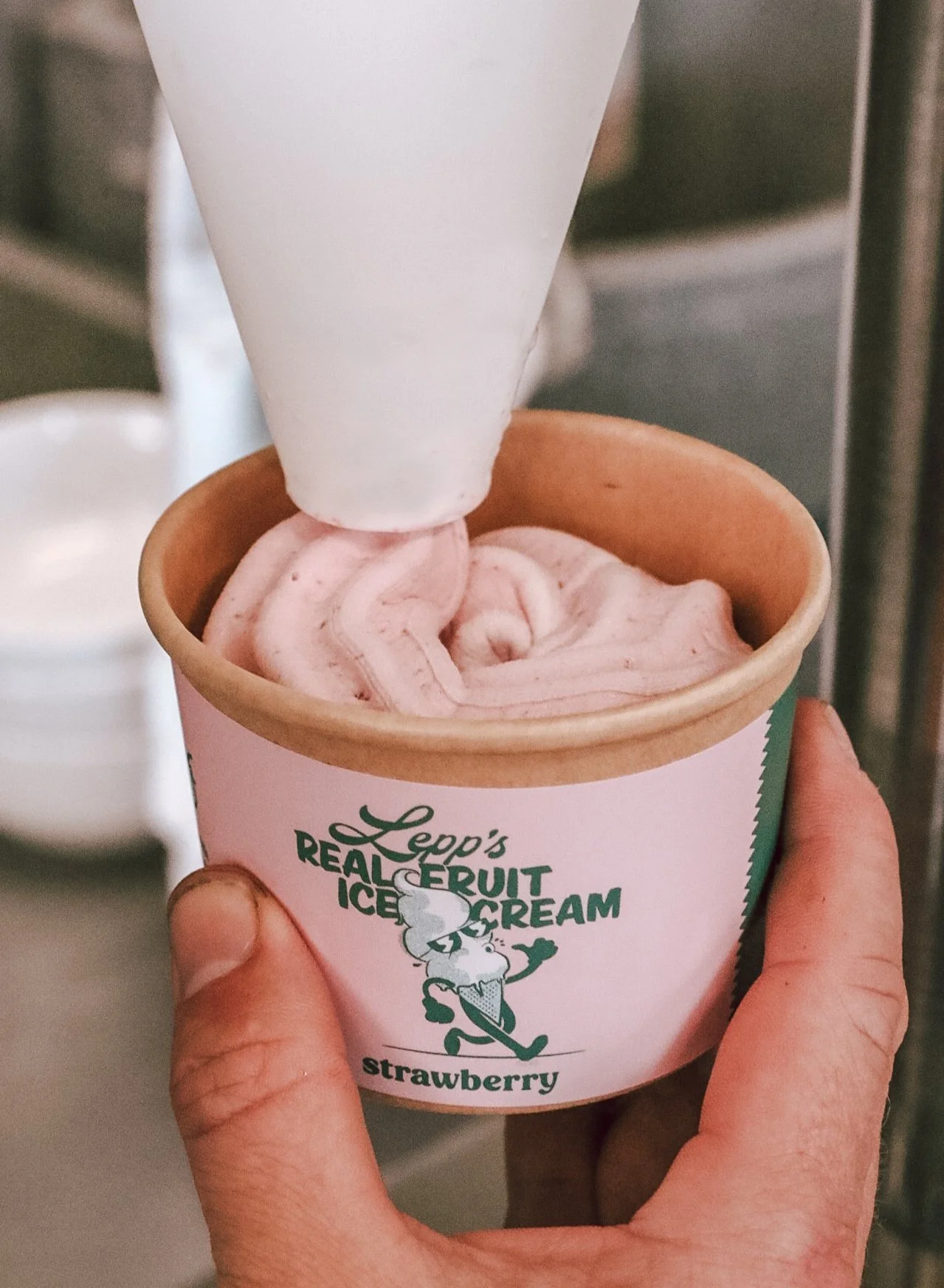
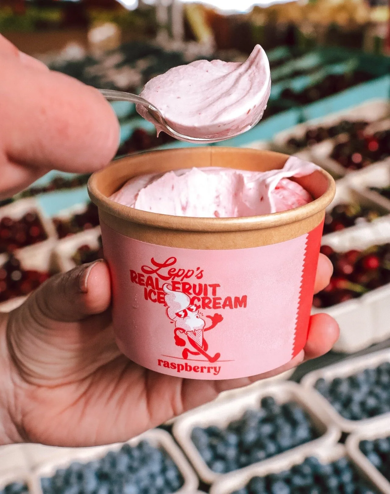
The team wanted bright and colourful labels that would stand out from behind a frosty freezer door, while still tying it back to the Lepp brand.
-
Based on some conversations with the Lepp Farm Market team about how they envisioned this ice cream brand, I came up with a new colour palette, font selection and illustrated mascot. I borrowed the existing Lepp’s wordmark from another project, and tied it all together in beautiful labels.
-
From paper to pixels, this illustration was created to embody the nostalgic, fun, care-free mood of the brand.
-
In total, we landed on 5 labels to kick off the product launch.
Custom Illustration
Bringing the Lepps vision to life.
The team wanted a label that was bright and colourful, and in addition to that, Jason Lepp wanted a vintage mascot illustration. I brought his vision to life with this rubber-hose style ice cream illustration.
Illustration and label design by Lydia MacPherson. Product photography by Trisha Wilcox.


